
Refreshing your home? We’re here to help with a list of our favorite paint colors, along with some real life examples of how we’ve used them in our clients homes!
One of the top requests we receive from clients wanting to update their home is helping to pick the perfect paint color. We know there is an overwhelming range of options, and lots of factors influencing why a color does or doesn’t work in a particular space.
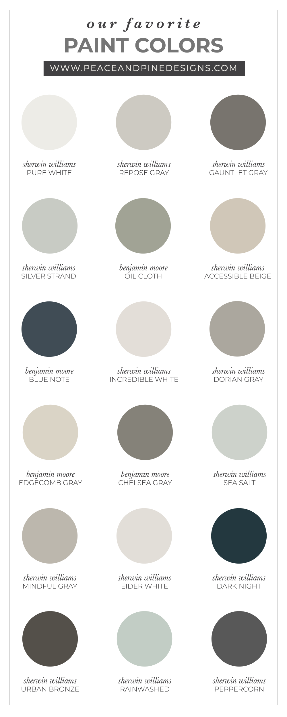
It’s no secret, we tend to gravitate to neutrals. We love the warmth of a perfect greige or the depth of a dark charcoal. But we equally love the subtlety of a dash of color and the boldness of a navy wall. We’ve cultivated some of our most favorite paint colors from Sherwin Williams and Benjamin Moore, including a long list of other options if you are looking to change up your space!
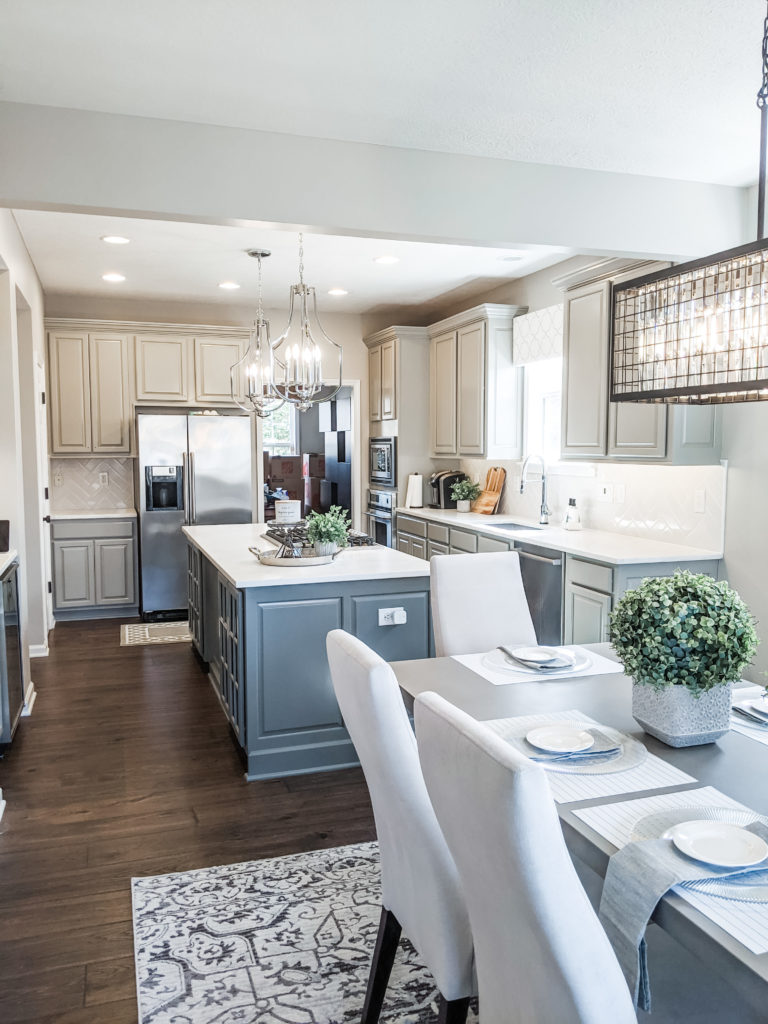
Sherwin Williams | Dorian Gray & Benjamin Moore | Chelsea Gray
In this recent kitchen renovation, we utilized BM HC-168 Chelsea Gray on the island and SW 7017 Dorian Gray on the perimeter cabinets. Accenting the island in a darker color or stain adds visual interest and depth to the space!
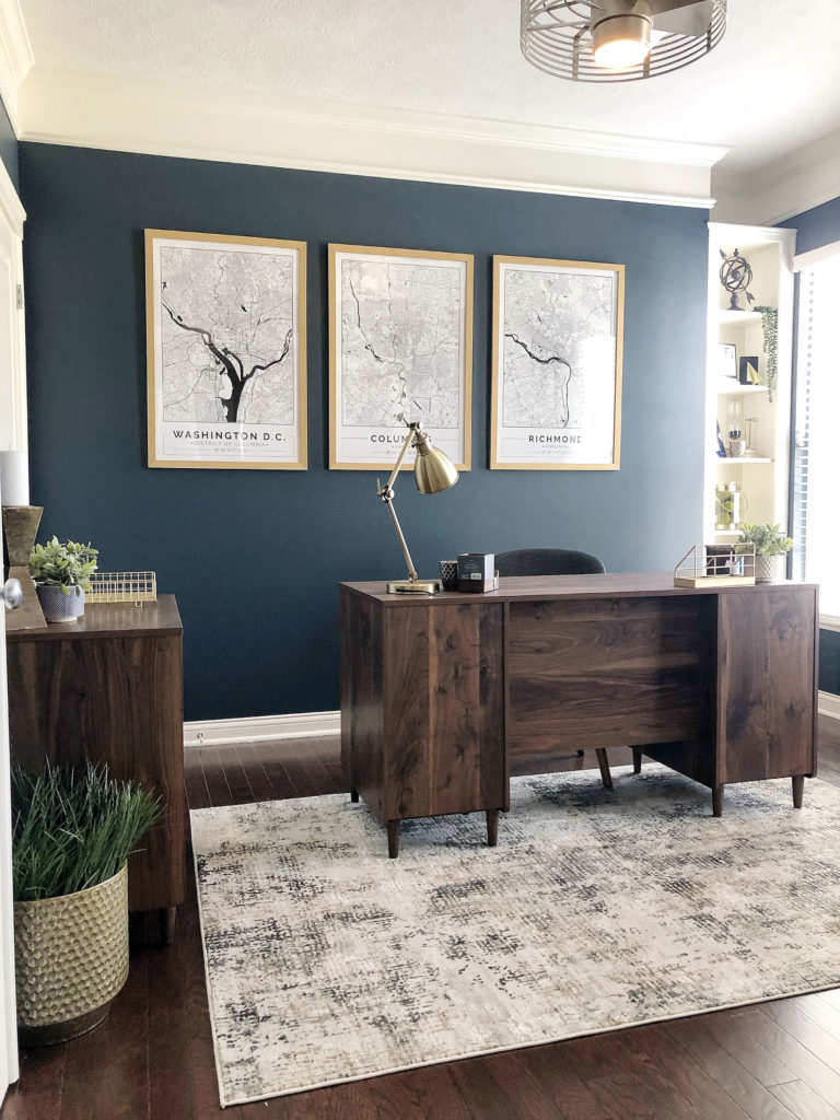
Benjamin Moore | Blue Note
We ADORE BM 2129-30 Blue Note. It’s the perfect muted navy blue–not too dark, not too light, just enough gray to keep it from being too vibrant, yet it still stands out as a gloriously beautiful color. Here’s a tip when using dark, bold colors: Make sure your room has enough natural light, and keep your accent decor light and airy to keep the room from feeling too heavy.
Sherwin Williams | Gauntlet Gray
When we installed this herringbone shiplap wall for our client, we opted for a medium gray. We loved how SW 7019 Gauntlet Gray adds some drama to this feature wall, and how it beautifully compliments the wall color, SW 7043 Worldly Gray. Another great option, and very similar color, is BM HC-172 Revere Pewter.
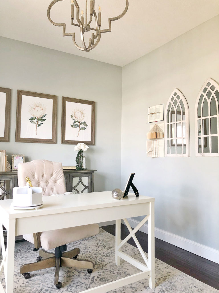
Sherwin Williams | Silver strand
Subtle blue and green toned shades are some of our go-to’s when we have clients looking to add a pop of color but still want to keep a neutral palette. This client’s feminine office using SW 7057 Silver Strand is the perfect example of this. It’s slightly blue green color still leans into gray. We also love SW 6204 Sea Salt which has even more hue.
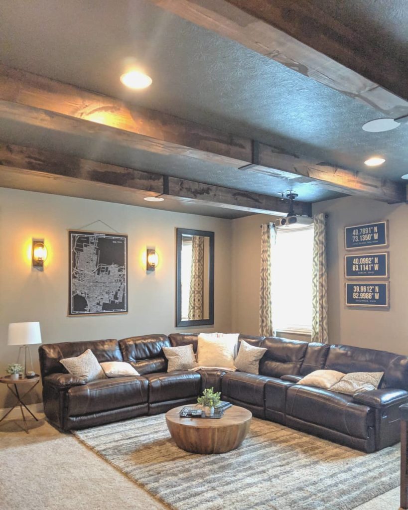
Sherwin Williams | Urban Bronze
When we helped this client design their bourbon themed basement, we opted for SW 7048 Urban Bronze on the ceiling to add drama and play to the rustic feel they were looking for. And because we know you’re curious, we used SW 7031 Mega Greige on the walls, another one of our personal faves!
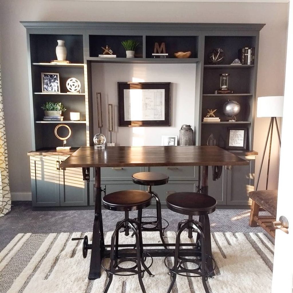
Sherwin Williams | Peppercorn
While we love clean, bright and white trim, it’s undeniable what dramatic accents like these bookcases can do for a space. When we revamped this clients room, we opted for SW 7674 Peppercorn to highlight the custom built-ins.
Sherwin Williams | Repose Gray
SW 7015 Repose Gray is perhaps one of our most used, most requested, and most recognized grays in our tool kit. It’s clean, timeless, and a safe option when you want a solid neutral. It’s light and bright, and helps reflect a ton of light, but it also stands out beautifully against bright white trim.
A few quick paint tips
Now that we’ve showed you some of our favorite paint colors, let’s talk about a few tips to help with choosing the right color and finish! When selecting a color for your space, paint a large poster board and hang up for a day or two so you can see how the color shifts in different light, and at different times of the day.
We highly recommend flat or satin to all of our clients in most situations. Not only do they minimize the amount of light reflected off the wall surface, but those finishes help hide wall imperfections. For trim, semi-gloss is generally best for for durability.
If you are struggling to decide on what works best in your space, we’re here to help with our best tips for home decorating! Columbus Ohio is our home base, so whether it’s an in person consultation, or a virtual meeting, we can help you decide what is best for your space. Email us or book a consult online and we would be happy to help you choose the right color for your space!
leave a comment